To Download Today's Infographic as a PDF, Click Here.
Everyone wants a bigger list.
More subscribers.
More reach.
More chances to make a sale.
That makes sense.
Growth feels like progress.
And in the world of digital products, newsletters, and personal brands, "grow your list" has become the rally cry of every creator playbook.
But here’s the part that doesn’t get talked about enough:
It’s not always the list that’s the problem.
Most of the time, it’s the way emails are structured.
You don’t need 10,000 subscribers to start making real sales.
You don’t need a perfectly crafted funnel or the latest automation tools.
You just need to stop making your readers work so hard to figure out what you want them to do.
Because if your email has a great offer—but it’s buried under too many paragraphs, links, or tangents—then you’re not making it easier for them to say yes.
You’re giving them reasons to exit.
Good emails don’t just get opened.
They guide. They clarify. They remove friction.
And they move people to take the next step.
That only happens when every part of the email—from the subject line to the final button—is built with intention.
Structure isn’t something you apply later. It’s what makes the message work.
Let’s walk through how that actually looks.
Why Email Structure Changes Everything
Most creators are writing the way they were taught to blog.
Long-form stories. Tangents. Personal anecdotes. Big paragraphs. Stream-of-consciousness updates. Tips wrapped in metaphors.
And while those things can work in the right medium, email is different.
In email, attention is shorter, competition is higher, and action is more fragile.
You’re not just fighting to be read. You’re fighting to be remembered.
Here’s the hidden truth:
The quality of your email doesn’t matter if the structure makes it hard to follow.
Even the best insight, written beautifully, will fall flat if the layout causes friction.
What kind of friction?
- Too many competing CTAs
- Story before context
- Dense paragraphs that don’t breathe
- No hierarchy in headlines or visual elements
- Multiple goals in one message
These break the reader’s momentum. And once you lose momentum, you lose the click.
Structure solves that by organizing the message around how people read—not how we write.
It builds rhythm. It separates value from pitch.
It guides eyes and decisions without needing to shout.
And when the structure is done well, the whole email feels effortless to read and easy to act on.
That’s the goal. Not just more opens. More outcomes.
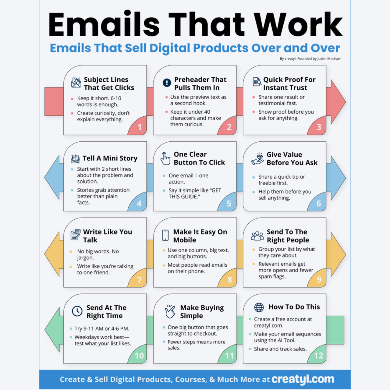
The 12-Step Email Framework That Actually Sells
Here’s the structure we use inside creatyl to help creators write fewer emails that make more sales.
These 12 steps aren’t arbitrary—they reflect how real people read, decide, and buy.
- Start with a subject line that gets opened (6–10 words max)
- Your subject line doesn’t need to be clever. It needs to be clear and make someone curious. Keep it tight. Test curiosity questions, surprising claims, or benefit-led statements.
- Use a preheader that teases, not repeats (under 40 characters)
- The preheader is your second chance to hook. Don’t waste it by repeating the subject line. Instead, open a loop or offer a payoff.
- Put proof up top before asking for anything
- Start with evidence. Show a result, a testimonial, a stat, or a success moment. It tells your reader, "This works."
- Tell a two-line story that shows a shift or result
- Humans connect to story fast. But in email, you don’t have time to ramble. Share a transformation in two lines: where you were, and where you ended up.
- Include one big, clear button with one job
- Don’t ask people to decide. Give them one button. One ask. Make it bold and unmistakable.
- Give free value first so they don’t feel sold to
- Offer a tip, a small lesson, or an idea that helps even if they don’t click. This builds trust, reduces resistance, and keeps people opening future emails.
- Write like a human, not a headline machine
- Drop the salesy tone. Write like you would speak to a friend. No jargon. No marketing cliches. Keep it conversational.
- Use a mobile-first layout that’s easy to scan fast
- Most people read emails on their phones. Use short paragraphs, big buttons, and clear headers. Make it effortless to consume.
- Send to a segment, not your whole list
- Stop blasting everyone. Send to the people who’ve clicked, opened, or visited recently. Relevance always wins.
- Choose the send time based on your audience data
- Test different times. Don’t assume "Tuesday morning" works for everyone. Look at your open data and send when your readers are most likely to engage.
- Make the checkout one step with zero friction
- Don’t bury the CTA behind multiple clicks. If they’re ready to buy, give them a direct path. Link straight to checkout or a one-click landing page.
- Track everything so you can learn what’s working
- Track subject line opens, click-throughs, conversion rate, and unsubscribes. Adjust your structure based on behavior.
This framework removes the guesswork. It replaces “try everything” with “do the right few things well.”
When used consistently, it transforms your emails from noise into systems that sell.
Real-Life Example: From Stuck to Sales in 48 Hours
Let me show you exactly how this framework plays out in real life.
I worked with a creator who had been consistently emailing their list of around 3,200 subscribers.
They were generous, consistent, and authentic.
Their audience liked them. Their offer was solid. Their subject matter was valuable.
And yet—sales from email were almost nonexistent.
They were averaging under 2% click-through rate. Purchases came in sporadically, mostly from DMs or random referrals.
Their open rates hovered around 22%. Not terrible. But engagement? Nearly flat.
They were doing what most creators do: writing long, well-meaning emails full of value, storytelling, and multiple links.
The message wasn’t wrong. It was just messy.
So we took one email—their launch teaser—and rebuilt it with structure.
We:
- Changed the subject line to a short curiosity hook
- Teased the result in the preheader
- Started the email with a real stat from a past launch
- Told a tight two-sentence story about how one small change drove huge returns
- Offered one bold button that led directly to checkout
- Added a tip that helped readers even if they didn’t buy
- Wrote it in the creator’s actual voice—no marketing buzzwords
- Reformatted it for mobile with one-column layout and white space
- Sent only to subscribers who opened or clicked in the last 45 days
- Sent at the highest-performing time from past sends
- Tracked everything using creatyl’s dashboard
That one email brought in more revenue than the past five combined.
It wasn’t luck. It was structure.
The Best Resources for Getting Better at This
If you want to go beyond surface-level email tips and actually master how to send emails that get results, here are three high-quality resources you’ll want to bookmark and come back to:
Book: Email Marketing Rules: Checklists, Frameworks, and 150 Best Practices for Business Success by Chad S. White
This book is widely respected for a reason. Chad S. White doesn’t just share strategies—he explains the "why" behind them. You’ll learn about formatting, list hygiene, segmentation, deliverability, and how to align email strategy with business goals. It’s straightforward, practical, and rooted in years of real data. If you want to get serious about email, this is a no-brainer.
Podcast: Everyone Hates Marketers by Louis Grenier
This is one of the best marketing podcasts for creators who value honest, no-BS strategies. Louis interviews top marketers, copywriters, and product builders—but the focus is always the same: clarity over gimmicks. The episodes on messaging, conversion copywriting, and ethical persuasion will change how you think about your entire content flow—including emails.
Tool: ConvertKit
While there are many email platforms out there, ConvertKit is built with creators in mind. It gives you smart tools for segmenting your list, setting up automation, and designing clean, mobile-friendly emails without needing design experience. Its built-in A/B testing, commerce features, and visual automation builder make it perfect for testing structure and seeing what actually drives clicks and conversions. It’s intuitive, reliable, and made for people who sell digital products, not software.
These aren’t shiny trends. These are tools and ideas that help you build a foundation that lasts.
Structure Is What Turns Effort Into Results
Why Clarity Creates Confidence
Most creators don’t fail because they don’t care. They fail because their message doesn’t carry.
They try. They write. They show up.
But their email doesn’t convert—and they’re not sure why.
It’s not about working harder. It’s about structuring smarter.
Your reader isn’t confused because your product is bad.
They’re confused because the email doesn’t make it easy to move forward.
Structure solves that.
It helps you write less and say more.
It gives your audience a reason to keep reading—and a reason to act.
It cuts down distraction, builds trust, and puts the spotlight exactly where it needs to be.
Sales don’t come from pressure. They come from clarity.
So if you’ve been writing emails that feel "good" but don’t perform, it might be time to stop writing and start building.
Ask yourself:
What would your next email look like if every sentence had a job?What would change if your readers knew exactly what to do—without being told twice?
That’s the kind of work that doesn’t just sell. It lasts.
Download the Full Infographic as a PDF
Want to keep the full email structure in front of you while you write?
I’ve turned the “Emails That Work” framework into a clean, printable PDF.
It includes all 12 steps from subject line to checkout—so you can use it as a quick reference every time you sit down to write.
- Clean layout for easy scanning
- Designed for digital product creators
- No fluff, just the essentials
Keep it on your desktop, print it out, or use it with your team.
Because when every part of your email has a purpose, every email has a better chance to convert.